Thursday, 27 September 2012

Final Piece Evaluation.

My final piece involved an animation of various cartoon characters changing from one to another, in black and white, my own cartoon face being the only that had coloured hair.
I drew up a template to base the characters on, and photocopied it.
On the photocopied templates,  i drew the cartoon characters from pictures i looked at on the internet, and tried to make them look as close to the real thing as possible. Then, i took photos of the drawings, making sure the size and lighting was exactly the same in each photo shot.
The photos were then stored on my USB stick, so i could take them into college and edit them together into an animation using Adobe Premier Pro. Once the pictures were together, i found an instrumental song and edited it into the animation, and added titles and credits.


In the build up to our final piece, we did a series of tasks which involved us looking at different portraits and artists.
The main artist i took inspiration from was Andy Warhol, as his art is very pop-arty, and modern.
A lot of his pieces of work look like they are done in cartoon style, and they are bright and eye-catching.
Because his style is like this, i took inspiration from his work, and based my animation drawings around his art.


Next time, the thing i would change would be the outline of the template, to not make it so heavy and easy to see. Also, i would draw more cartoon characters, so the animation wouldn't have to be looped twice. As well as that, i'd make it so the characters do actions instead of just change from one to another.
Nobody Beats the Drum Critique.

I watched the video 'Grindin' by 'Nobody Beats the Drum'.

The music video was created using blocks which were coloured with various lights.
The blocks moved to the beat of the song and the lights also changed, making the video look dynamic, modern and interesting to watch.

The movements of the blocks were perfectly synchronised to fit the song, and it obviously took a lot of time using stop motion to create it.

When the song got a bit faster and heavier, the blocks moved a lot faster, and the lights followed suit.
The music video was great to watch, despite having a simple idea to it.

Papermation Research - South Park Critique.

I watched an episode of South Park season 7 episode Red Man's Greed.

They used the stop motion technique to create the episode, and it made it really interesting to watch.
The movements aren't smooth, but i think it adds to the aura of the cartoon, making it more interesting to watch.

The language they use in the episode is quite degrading though, and their humor can be quite offensive if you don't take it lightly.
I know South Park have received complaints about the jokes they use, but they continue to work this way, and the show still gets views.
The target audience i'd say is mostly for those with crude humor and mostly teenagers.

Thursday, 20 September 2012

Evalution of the Day.

I spent today making a mind map about the work we have previously done on the course.
The mind map included colourful titles and colourful descriptive texts to make it all stand out.
Also, on the next page of my sketchbook, i did a brief evaluative summary of each project we did.

For each of the evaluative descriptions, i discussed the materials i used, what i had to do for the task with the materials, and if the task was successful and effective, and what to improve on next time.
I evaluated for the tasks in which we made the Comic Strips, ID Cards, Countdown and Paper Faces, even though i wasn't present for the Paper Faces task.

There is a check list for all the things we need to do by Thursday next week to pass, which includes:
Mind map of the work done so far.
Research on animation and portraiture artists.
Write-ups of projects done so far using different materials in animation (Drawing, Beads, Paper, Photography).
Critique 'Nobody Beats the Drum' (the use of blocks).
Papermation research (South Park Critique: Paper as a form of animation).
Big Draw evidence.
Print outs of everything from your blog stuck in sketch book.
Mind map of final piece (Black and White Face).
Final Piece black and white animated portrait.
Evaluation - How did the creative craft (portraits) help support your techniques and processes (Paper Faces Animation).

In the last part of the day, i brainstormed and mind mapped ideas about what i would do for my final piece of a face animation. I wrote down such ideas like the location ideas, music, character templates, and whether the shots will be zoomed in or out.

Also, we had to research about claymation animation. Here is the information i found out about it.

Claymation is a form of stop motion. You can create anything out of a malleable substance, like plasticine, and use it to create anything and move it. You take pictures of each of the movements, and in the end, edit them together to create an animation.
It's sometimes important to make sure the lighting stays the same, to keep the atmosphere and idea the same. You don't want a cheery animation to turn into a negative one because it began to get dark.
Also, it's a wise choice to use a tripod to make sure the pictures you take stay in the same position and don't shake when you put the animation together.
The whole process is very laborious process.
Clay animated films were produced in the United States as early as 1908, when Edison Manufacturing released a trick film entitled The Sculptor's Welsh Rarebit Dream. In 1916, clay animation became something of a fad, as an artist named Helena Smith Dayton and a West Coast animator named Willie Hopkins produced clay-animated films on a wide range of subjects. Hopkins in particular was prolific, producing over fifty clay-animated segments. Three-dimensional forms such as clay were driven into relative obscurity as the cel method became the preferred method for the studio cartoon.

Monday, 17 September 2012

Wallpaper and Animation.

Today, we had to go to the library to find 4 different portrait images and note the artist's name who created them. I found various images from artists such as Vincent Van Gogh, Alex Katz and Jean-Antoinne Watteau.
We took photos of the images and went back to our room and used the end of a paintbrush and ink, and painted out our interpretations of the artist's portraits.

We recorded our progress as we went along with each portrait with a camera. Everyone had a 'bubble' or area to paint, and once it was painted, we moved to a different area.

After lunch, we edited the images we took together using Premier Pro and created them into an animation and saved it to our memory sticks.

We then did a write up on notes about the artists we used today.
I printed off pictures and stuck them in our sketchbooks to help with the annotations.
Here is some of the information i got whilst researching. It is best seen in my sketchbook.

Alex Katz.
Alex is an American figurative artist associated with pop art. Katz's paintings are divided equally into the genres of portraiture and landscape. Since the 1960s, he has painted views of New York, the landscapes of Maine, where he spends several months every year, as well as portraits of family members, artists, writers and New York society protagonists.

Tuesday, 11 September 2012

Animation Research.

The animation artist i have chosen to research about is Tim Burton.
Originally, he was born and raised in California.
He was born in 1958, making him 54 years old today.

Throughout his career, Tim Burton has worked with many actors, artists and directors.
Whilst working with Henry Selick, he produced The Nightmare Before Christmas and James and the Giant Peach.
His most famous works are filmed with Helena Bonham Carter and Johnny Depp. Together, they've made and co-produced these films:
Ed Wood, Sleepy Hollow, Charlie and the Chocolate Factory, Corpse Bride, Sweeney Todd: The Demon Barber of Fleet Street, Alice in Wonderland, and Dark Shadows.
Burton has directed 16 films and produced 12, as of 2012.

To produce these films, he's worked under Walt Disney animation studios.

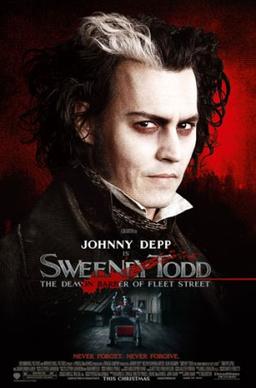
One of his most famous creations is Sweeney Todd.
This film is about a barber serial killer who murders his customers with a razor.
His accomplice Mrs Lovett, helps him to bake meat pies out of the bodies of his customers.

The style of animation he works with is dark, yet funny.
My favourite films of his are Sweeney Todd, Sleepy Hollow and Dark Shadows.

I chose to investigate this artist because his films are really good, i like how dark they are, and funny and i like the style of animation he uses in his films.


ID Cards

This afternoon, we had the task of taking pictures in pairs, i was with Emily, and we had to take at least 5 pictures of ourselves.
Once we had the pictures, we had to edit them to the right size in PhotoShop, then resaving them onto our memory sticks.

We then opened up Adobe Premier Pro and copied the pictures into a file, and put them onto the timeline. I cropped the size of each photo down a bit, so it wasn't so long in the video.

I then saved and exported the video onto my memory stick, and saved it to Cam's laptop for the class.

Artist Research.

The artist i researched about was Edvard Munch, who was from Norway and lived from 12th December 1863 - 23rd January 1944.

Edvard has worked with various unknown artists in his career, and was artistically supervised by the artist Christian Krohg when he lived with a group of friends.

He enrolled at the Royal School of Art and Design of Christiana when he was studying art.
He created most of his famous works when he travelled to Berlin and France.

His most famous creation is 'The Scream'.
This painting is depicted as representing the universal anxiety of modern man.
Originally, the painting was called 'The Cry'.
The story behind this came from his memory of a sunset.
He recalled walking down a road with a group of friends when the sun was setting, and stopped walking, feeling anxious about how blood red the sky was.

I chose to investigate this artist because his  'The Scream' painting is one of the most famous in the world, and i like the fact most of his pieces look almost realistic, but still have that part of looking abstract.


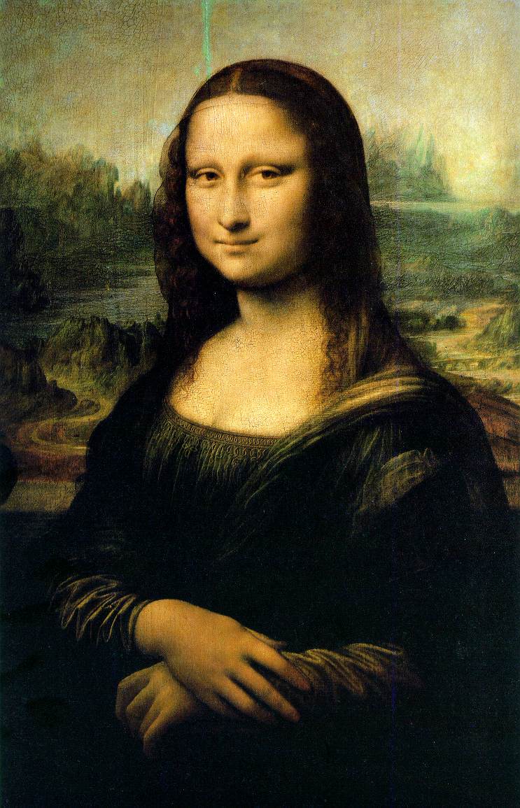
Another artist i researched about was Leonardo da Vinci, who was from Italy, and lived from 15th April 1452 - 2nd May 1519.

Leonardo has worked with various artists, including Antonio Pollaiuolo the portrait sculptor, and Mino da Fiesole, when he did an apprenticeship.

His most famous piece of work is 'The Mona Lisa', which is arguably the most famous painting in the world.
The subject in the painting, supposedly Lisa del Giocondo, was a member of a wealthy family from Italy, and Leonardo created the painting for their new home and the celebration of the birth of the family's newest baby.

I chose to investigate this artist because 'The Mona Lisa' is the most well known, and parodied painting, which i thought was interesting. I also wanted to find out more about the painting, as it's hard to figure out the various mysteries.


Monday, 10 September 2012

The Big Draw.

Today, we had to research about an artist and create our own version of a piece of their work, in groups.
Once in a group with Dylan, Roxy and Becky, we picked the artist Terry Frost, then we went to the library and found a book on some of his work.

We picked an example of his work and photocopied the picture, so we could use that as a base to work with.
We drew the outline, and began to paint it in, taking photos along the way.

Also, part of today's task involved us finding out information and facts on Terry Frost, and recording it in a Word Document.


Thursday, 6 September 2012

Countdown.

Today, we had the task of picking a number from random, and drawing it into something creative.
For example, i had the number 4, and i drew it into a cartoon. It was kind of difficult as it was hard to imagine a face on the number 4.

Then we took a picture of our drawing, and had to go around the college to find different examples of our number.
We saved these onto a memory stick and gave them to Cam, to make them into an animation.

Tuesday, 4 September 2012

Animation.

In today's lesson, we looked at a timeline of animation throughout the ages, and how much it's changed over the years.
For instance, animation started out as simple moving images, created by taking lots of pictures of an object and editing them all together.
Then, it started to get more advanced, and film companies started to create films and cartoons, such as Felix the Cat, Donald Duck and Betty Boop.

The main founder of cartoons, Warner Brothers, was created, and more and more animations were invented. Mickey Mouse became an icon.
This was the beginning of something big, as Warner is one of the most well known companies in the world. Many films today have taken inspiration from the early stages of cartoons from Warner, thanks to the early animations.
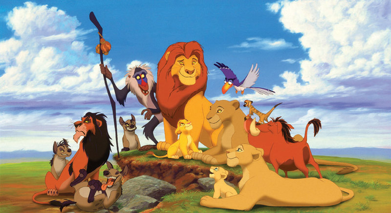
Animation got more advanced, allowing feature films like Cinderella and Lion King to be created.

The use of CGI became more advanced, so films like Jurassic Park hit the big screen.
Claymation was also a popular choice of animation, for shows such as Wallace and Grommit.

As part of our task today, we had to draw ourselves as portraits on film strips, and what helped represent us.
As an example, i drew myself with red hair, holding a concert ticket, because it's what i love.

About Me

Name: Jade

Age: 17

Favourite colour and why:
Orange is my favourite colour because it looks good with anything.

Favourite smell and why:
Food because it makes me hungry.

Favourite touch and why:
Paper, because it reminds me of Christmas.

Favourite food and why:
Pizza because you can be in any mood to eat it.

Favourite animal and why:
Lion because of the Lion King.

Favourite animated character and why:
Simba from the Lion King because i grew up watching that film.

Favourite thing to read and why:
Kerrang magazines because of the variety of music.

Favourite song and why:
Run Free by Asking Alexandria because it's a new song.