Wednesday, 27 February 2013

DVD Covers.

Thor.


The DVD cover for Thor is quite dark. The main character is seen covering the main part of the front cover, with the supporting characters above.
The back cover is a bit crowded with loads of text and pictures, but it's sure to incude every bit of information of the film, without giving too much away.


The DVD cover for The Runaways looks a bit different from the usual DVD covers you'd see, purely because the main protagonists are seen covering the main part of the front cover. You can tell what the film is about by the image of a guitar and amplifier next to them.
The back cover has a decent amount of text and pictures. It looks kind of rough in all, i think purposely done to give it the effect of a rock band's persona.
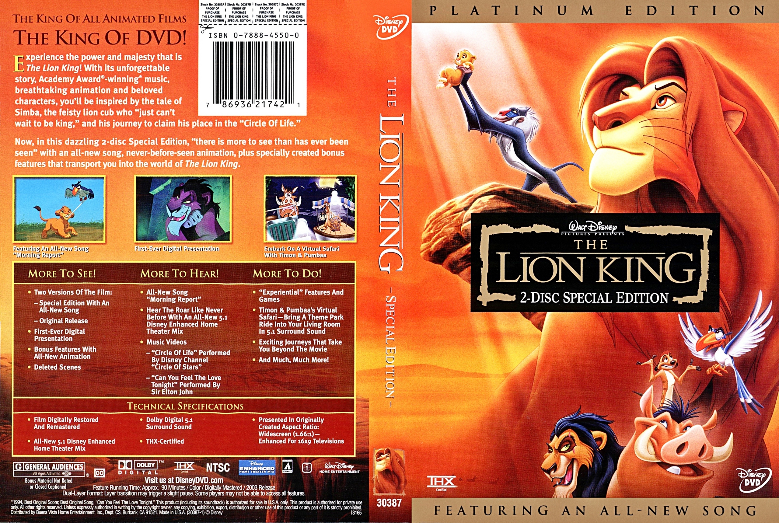


The DVD cover for The Lion King looks like it's sure to stand out in the DVD section of a shop, because of the bright colours and by having such a bold character on the front. It doesn't give any major part of the film away spoiler wise, which is great for people who haven't yet seen it.

The back cover isn't overcrowded at all, so it makes for simple reading. It includes the DVD extras, and voice actor information, as well as a short description of what to expect in the film.

Body Modifications Documentary Evaluation.

My documentary was about bodily modifications. These can vary from people getting piercings, to tattoos, or dying their hair different colours.
This documentary includes people's views on the different modifications, and some video examples of different experiences.

I made this documentary because it's a subject i've always been interested in, and i knew it would be interesting and a bit controversial.
I found a few people with good examples of tattoos and piercings, and interviewed them on their views of body modifications and how they may affect their future, in getting a job, for example.

The background music was from the orignal youtube videos on the first video, and for the end credits, i just used a royalty free instrumental song, which i thought fitted the ending.
I used Windows Movie Maker to edit the video together, as i was pressed with time, and had to do it at home. It was simple to edit, converting the videos to the correct formats so they could be used, and cropping them where necessary.

I think my documentary is good; it's entertaining and fun to watch because it has a variety of different clips, like interviews and short videos.
I think it highlights people's views on body modifications, and how people have different opinions on them, with regards to the future.
However, if i were to change anything, i would make sure to next time interview more of a variety of people, like elderly people, or people in the military.
The documentary reached the ideal timescale, but i would have enjoyed to make it longer.

Artists who inspire my DVD artwork.

Chip Kidd.

Chip Kidd is a famous graphic designer and writer, working in New York City. He mainly designs book jackets, working for Alfred A. Knopf since 1986. Kidd also designs as an editor of books and comics.
His most famous design for Michael Crichton's Jurassic Park novel was carried over into marketing for the film adaptation.
20 Graphic Designers You Should Know
Paul Rand.


Paul Rand was an American graphic designer, who is internationally acclaimed for his corporate logo designs. His most famous designs are for IBM, UPS, Ford and ABC.

paulrand 9 Inspiring Graphic Designers and their Distinct Design Styles


John Henry Alvin.
John Alvin was an American graphic designer, who is most famous for his designs of movie posters. His first official design of a poster was for the film 'Blazing Saddles' starring Mel Brooks in 1974. His work for such high profile film studios as New Line Cinema, Warner Bros. Entertainment, Disney Studios and Lucasfilm Ltd., included Blade Runner, Cocoon, The Lost Boys, Predator, The Princess Bride, Gremlins, The Lion King, Beauty and the Beast, Batman Returns, Batman Forever, and Jurassic Park. He also created the anniversary posters and other artwork for the 30th anniversary Star Wars Celebration.

johnhenryalvin3 9 Inspiring Graphic Designers and their Distinct Design Styles

Monday, 25 February 2013

Jasper James style images.

This is the silhouette of Rita Ora on the background of the Union Jack flag.

I opened Photoshop and created layers, to which i cropped around the part of the image of Rita i wanted to include; her silhouette.
I then coloured the background around it in white with the paint bucket tool, and created another layer, for the Union Jack background, to which i copied the image silhouette of Rita.
I then saved the image i created and uploaded it here.

It was quite difficult, because i'm not used to using Photoshop like this, but i managed in the end.
Next time however, i'd chose a different silhouette, one that's more defined and looks easier to guess who it is.