Thursday, 6 June 2013

FMP Evaluation


Final Major Project Evaluation

For my final major project, my decision was to make a video log (vlog). We were given the brief of time and space, so as long as we kept it within that, it'd be fine. I've themed it on a week in the life of me - so I filmed various moments of my life and my journeys. It’s meant to act as a video diary – something that will always be available to watch at anytime.

My vlog is technically a video diary of events I’ve got up to in one week.
Using all the time I had for the project, the outcome matched my vision of the project perfectly. It includes some poignant parts of my life, which I’m happy to share with the audience. It gives an insight into how things change in life and how things can change so easily.
I took inspiration for my vlog from various YouTubers, but two channels in particular.
Prank Vs Prank are a couple (Jesse and Jeana) who pull various pranks on each other, and secretly film it without the other knowing.
The reviews for their videos are mostly positive, however some viewers get worried that one day a prank will go too far and it might cause them to break up.
CTFxC (Charles and Alli Trippy) upload daily vlogs onto their YouTube internet series Internet Killed Television. They film every moment of their day, even emotional events like their wedding, and when Charles had a seizure.
Recently, Charles became the bassist of the band We the Kings, so now most of their vlogs double up as a tour diary as well.

My original aim for the vlog was to include a wider variation of videos. For instance, I wanted to include some clips of my mum instructing me on how to drive, with her holding the camera as a different point of view. Also, I planned to go to my Gran’s grave on a different day and stay a bit longer to lay more flowers.
Despite this though, my vlog turned out pretty well, it had elements of these missing videos.
Another thing was that I wanted to include a few decent snippets of songs to go in the background, but I was pressed for time to edit the video together, so I chose simple songs to put in certain parts of the background of some videos.

My plan changed a few times during the process of filming and editing the vlog.
What went wrong was I intended to film a driving lesson with my mum, however we couldn’t find a decent time or place to film it, as she was busy working at most of the times I wanted to go out.
I planned originally on filming a lot more with my friends when we went out around town and to gigs. I forgot to film on those occasions, which put me at a loss, because those clips could have helped to lengthen out the vlog.
There were a lot of points that went well.
For example, when I was due to go up to see a band play in Bristol, I had to wait in the car for my mum to finish a job. So I entertained myself.
It helps make the vlog more humorous.

The journey into producing the final piece was interesting and challenging.
For the most part, I knew what I was doing. I had a specific plan with a time for each section of the video.
Although there were a few hiccups in the process and it turned out not 100 percent as I imagined it would, it was good enough to meet the brief I designed for myself.
Getting the clips together themselves was fun and easy for me, as I have previous experience with filming and editing vlogs together. I had the motivation to specifically go out, get some friends together and film whatever I needed.

If I were to do the project again and improve it, I would work on my time management a bit more.
There was a struggle sometimes to figure out what to film, so a lot of the videos I had had to be scrapped because they were completely irrelevant and too boring for the vlog.
I had a bit of a last minute rush to edit the clips together and find appropriate sounds to fit in with it.
This ties in with the organisation. I could have had a back up plan for the times when I stalled on filming, where I could have started editing ahead. Instead, I waited for all the videos to be filmed, and pressed on with editing in one night. It was a bit rushed at the end, but I got it done eventually!

My work would be best displayed on YouTube. That’s where I intend to upload it anyway.
It’s going to be available to view in the Plymouth College of Art Summer Show, for members of the public and the rest of my class to watch.

My final piece is something I’m very proud of.
The thing I think I like most is the memorial to my Gran. It’s a clip of her talking about her memories. It’s emotional for me, but I think it’s what makes the vlog more serious, and gives the audience a proper insight to my life.
I also like how it involves both my friends and members of my family. It’s definitely the best project I’ve done, the process itself went really well, and I’m pleased with the outcome!

Monday, 29 April 2013

Target Audience Poster


This is my target audience poster, explaining what types of films, music, TV shows and websites i like. 
I collected some together on a list, and included them in this poster, explaining who i thought would be the ideal target audience.

Monday, 22 April 2013

Final Major Mindmaps


Artists that relate to my Final Major Project

CTFxC (Charles and Alli Trippy - YouTube)
CTFxC has a web series called Internet Killed Television, which documents the lives of Charles Trippy, his wife Alli and their dogs Zoey and Marley.
The show consists of episodes averaging around six to twenty minutes that are filmed, edited, and then uploaded every day onto YouTube. The series was originally planned to last for only one year, but after the success of the first season, they decided to continue. The YouTube series has now reached its fourth year and every year, they ask their audience, the CTFxC(ers) to create a montage featuring the main events that had occurred that year. They literally have thousands of videos, but some of my favourites were from the first season. Their vlogs are what inspired me to do mine on my YouTube channel, however, mine aren't uploaded every day.

Prank Vs. Prank (Jesse Wellens and Jeana Smith)
PVP is a YouTube channel created in 2007 by this couple. They both play pranks on each other, sometimes physical, sometimes manipulative, and post videos of them on YouTube. The channel has had 386,932,087 video views, and 2,560,788 subscribers as of April 20, 2013. The channel was started when Jesse tricked Jeana into eating a spoonful of cinnamon. The reaction was posted on the Internet, starting the tradition of pranking each other and posting the videos online. Some of my favourite videos of theirs are 'Toilet Paper Gun Prank' and 'Surprise Haircut on Girlfriend'. Their videos have elements in them that i want to include in my vlogs.


Wednesday, 17 April 2013

PCA Media Video Critique

Dragonfly
This video was really interesting. It played with different perspectives and camera angles, to make it seem like people were interacting with objects in an unusual manner.
It explores loads of different camera angles, giving the effect of making people look bigger or smaller than the object they're interacting with. For instance, there was a person far away in the background being 'squashed' by a 'giant' shoe.
You don't see a lot of these videos; it's really creative and uses the imagination.
The music in the background is really fitting, it's slow and acoustic. It makes for easy listening, so you're mainly focused on what's going on in the actual video.

http://vimeo.com/59143259


Swish Cut
This video is kind of different to normal videos. I like how it uses a completely abstract camera angle, so it's set in first person. You see the story being told out like it's from your own eyes.
The storyline behind it is decent as well - it's based around an envelope, and everyone seems to want it and go out of their way to get it.
On the camera views, it gives me a good idea for my final major project. It's unusual and makes it interesting to watch.
The background music is suited well to it. It sets the tone and mood for the clip.

http://vimeo.com/44729538

Final Major Vlog Ideas

I've decided to make the vlog about nothing serious. I'm literally going to film what i do in my daily life, or a few road trips to places, like town and maybe around different cities depending on if i can get there. I'll try and make it a bit humorous.

Ideas to film:
Road trip / day trips
A day around town with some friends
Stories about something that happened in my life
Going to Livewire (Saltash) and the bands
Re-enact something, like a film clip
Challenge videos, like the Cinnamon Challenge or Milk Challenge
Do a PVP (Prank vs. Prank) style skit
Take Yoshi (my hedgehog) or Max (my puppy) for a walk
Learn a new skill and film it
Town (the Hoe) have a look around the war memorials
And then go diving in the water.

FILL A ROOM WITH BALLOONS.

Thursday, 11 April 2013

What Is The Final Major Project?

The purpose of our final major project is to have something to show in the Summer Show, as well as to show what we've achieved during our college course.
We have the choice to produce either a film or photography piece. My choice is to do a film. It has to be no longer than 15 minutes, and it can contain anything i want, presuming there's no bad language, or anything too extreme.

At the stage i'm at now, which is planning an idea, i don't have much planned. The only thing i have is to make a vlog (video blog).
Altogether, we need to have produced a portfolio, in sketchbook form, talking about how we'll present and organise our work.
Pre-production documents including film critiques, questionnaires, location photographs, character biographies and a Proposal Form.
Production documents including storyboards, location recce, risk assessment, scripts, production diary, treatment, team list and equipment list.
We also need to make a pitch, which will be presented in front of the class for 10 minutes.

At the end of the project, i hope to have produced a finished vlog for the final major project, complete with all the documents we needed and complete.

Monday, 8 April 2013

Xena Magazine Article

Today we were given the task to create a short magazine article on any television series of our choice. I chose Xena: Warrior Princess, because i am obsessed with it at the minute.
I wrote out some text in Word, and copied it over to Photoshop, where i created this finished article product.

Thursday, 14 March 2013

DVD Cover Evaluation.

To make my DVD cover for 'Body Modifications', i opened Photoshop and set a template in the sizes 272mm high, 183mm wide. I copied and pasted pictures from Google onto the front cover; a picture of Rick Genest, who stars in my documentary. I then added text for the title using the text tool, and simply selected a font.
I used the line tool to create a space for the spine, and insterted the age certificate picture, and title of the documentary.
The back cover had a picture of my tattoo copied from my facebook, because the brief suggested we include one of our own pictures.
Then i included a quote i made about the documentary with a picture of four stars for the rating, to make it look a bit more authentic. I then wrote out a bit for the description, simply explaining what subjects are arisen in the documentary.

The thing that challenged me the most was figuring out how to rescale images. I Googled help on how to do it, and found out it was an option in edit.
I've learnt loads of new skills, like how to resize images, improvement on my layer work, and how to rotate text.

I think my biggest achievement was using the layer technique to safely add new things onto the document. Before, i couldn't do this on my own without help.
I'm happy with my final product. I'd say it looks pretty simple, yet the colour will draw anyone to the cover.

However, i could improve by maybe adding a splash of colour in somewhere, or giving credits to who is in the documentary.
I didn't plan the cover due to me missing a few lessons in college, but i think i worked fast and well to catch up with the rest of the class.

DVD Cover.


This is my complete DVD cover for my Body Modifications DVD.
I think it looks good; it would stand out on a rack of other DVD's, because of the white background, and sharp figure of Rick Genest.
I kept the back cover text short and simple, explaining delicately the subjects in the documentary.

Wednesday, 27 February 2013

DVD Covers.

Thor.


The DVD cover for Thor is quite dark. The main character is seen covering the main part of the front cover, with the supporting characters above.
The back cover is a bit crowded with loads of text and pictures, but it's sure to incude every bit of information of the film, without giving too much away.


The DVD cover for The Runaways looks a bit different from the usual DVD covers you'd see, purely because the main protagonists are seen covering the main part of the front cover. You can tell what the film is about by the image of a guitar and amplifier next to them.
The back cover has a decent amount of text and pictures. It looks kind of rough in all, i think purposely done to give it the effect of a rock band's persona.


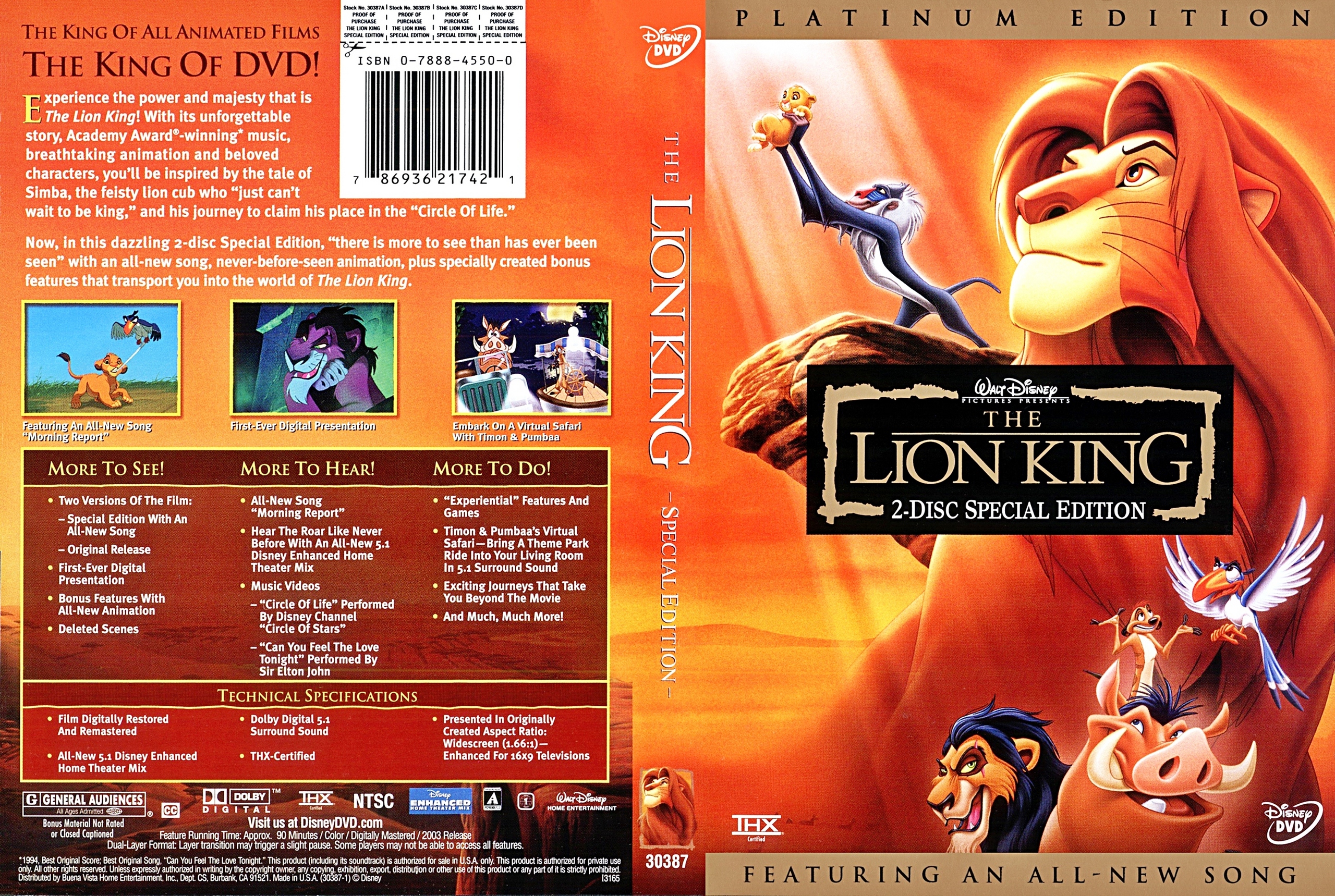
The DVD cover for The Lion King looks like it's sure to stand out in the DVD section of a shop, because of the bright colours and by having such a bold character on the front. It doesn't give any major part of the film away spoiler wise, which is great for people who haven't yet seen it.

The back cover isn't overcrowded at all, so it makes for simple reading. It includes the DVD extras, and voice actor information, as well as a short description of what to expect in the film.

Body Modifications Documentary Evaluation.

My documentary was about bodily modifications. These can vary from people getting piercings, to tattoos, or dying their hair different colours.
This documentary includes people's views on the different modifications, and some video examples of different experiences.

I made this documentary because it's a subject i've always been interested in, and i knew it would be interesting and a bit controversial.
I found a few people with good examples of tattoos and piercings, and interviewed them on their views of body modifications and how they may affect their future, in getting a job, for example.

The background music was from the orignal youtube videos on the first video, and for the end credits, i just used a royalty free instrumental song, which i thought fitted the ending.
I used Windows Movie Maker to edit the video together, as i was pressed with time, and had to do it at home. It was simple to edit, converting the videos to the correct formats so they could be used, and cropping them where necessary.

I think my documentary is good; it's entertaining and fun to watch because it has a variety of different clips, like interviews and short videos.
I think it highlights people's views on body modifications, and how people have different opinions on them, with regards to the future.
However, if i were to change anything, i would make sure to next time interview more of a variety of people, like elderly people, or people in the military.
The documentary reached the ideal timescale, but i would have enjoyed to make it longer.

Artists who inspire my DVD artwork.

Chip Kidd.

Chip Kidd is a famous graphic designer and writer, working in New York City. He mainly designs book jackets, working for Alfred A. Knopf since 1986. Kidd also designs as an editor of books and comics.
His most famous design for Michael Crichton's Jurassic Park novel was carried over into marketing for the film adaptation.
20 Graphic Designers You Should Know
Paul Rand.


Paul Rand was an American graphic designer, who is internationally acclaimed for his corporate logo designs. His most famous designs are for IBM, UPS, Ford and ABC.

paulrand 9 Inspiring Graphic Designers and their Distinct Design Styles


John Henry Alvin.
John Alvin was an American graphic designer, who is most famous for his designs of movie posters. His first official design of a poster was for the film 'Blazing Saddles' starring Mel Brooks in 1974. His work for such high profile film studios as New Line Cinema, Warner Bros. Entertainment, Disney Studios and Lucasfilm Ltd., included Blade Runner, Cocoon, The Lost Boys, Predator, The Princess Bride, Gremlins, The Lion King, Beauty and the Beast, Batman Returns, Batman Forever, and Jurassic Park. He also created the anniversary posters and other artwork for the 30th anniversary Star Wars Celebration.

johnhenryalvin3 9 Inspiring Graphic Designers and their Distinct Design Styles

Monday, 25 February 2013

Jasper James style images.

This is the silhouette of Rita Ora on the background of the Union Jack flag.

I opened Photoshop and created layers, to which i cropped around the part of the image of Rita i wanted to include; her silhouette.
I then coloured the background around it in white with the paint bucket tool, and created another layer, for the Union Jack background, to which i copied the image silhouette of Rita.
I then saved the image i created and uploaded it here.

It was quite difficult, because i'm not used to using Photoshop like this, but i managed in the end.
Next time however, i'd chose a different silhouette, one that's more defined and looks easier to guess who it is.

Thursday, 31 January 2013

Documentary Trailer


Here is the short teaser for my Body Modifications Documentary.

ENJOY THE EYE TATTOO.


Wednesday, 30 January 2013

Equipment and Team List for My Documentary.

Equipment.

Digital camera
USB Stick
iPhone connection lead
SD cards


Team.

Myself
Various people around town
Some friends
Older/elderly people

Monday, 21 January 2013

Photography Storyboard.

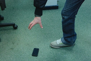
 Kat has a new iPhone. In her hands.
 She drops it on the floor for everyone to see.
 Dylan spots it, and goes to pick it up. Thief.
 Kat is upset from her phone going missing.

Dylan has the iPhone.
He then runs away with it.

Photography - Mise en Scene.

Tiananmen Square (1989) - Stuart Franklin Magnum.
Protest
War
Conflict
Rebelling
Tanks - Power, Control, Dominance

Albert Einstein (1951) - Arthur Sasse.
Genius
Candid
Personal
Humourus
Memorable

Niagra Falls Frozen (1848) - Unkown.
Isolation
Exploring
Winter
Abnormal
Unbelievable

Child with a Toy Hand Grenade in Central Park, New York (1962) - Diane Arbus.
American
Vietnam War
News
Strange
Desperation
Anger

Body of Che Guevara (1967) - Freddy Alborta.
Death
Success?
Power - Being portrayed as the lesser man
Heroes

The Raised Flag at Iwo Jima (1945) - Joe Rosenthal.
War
Brotherhood
Patriotic
Power
Success
Propaganda

Darkroom Health and Safety

When we go into the darkroom, we need to stick to typical health and safety regulations.
Because it's dark and any source of light will ruin the photos.
So, we can't take out our phones or any other source of light. And because it's dark, we need to be careful when walking around and using the equipment.

Also, when you use the Ilford machine, you need to make sure  you have the paper the right way around, shiney side down, and make sure its within the guidelines.


Thursday, 17 January 2013

What is Documentary?

Documentaries are created to show people different realities in life.
It for example, could show the different ways people live, or how certain things are done and achieved.

They can be about literally any subject matter in the world. For example, there are most documentaries on different countries, and ways people live in those countries, like what they eat, how they dress and everything.
Other documentaries could be about food. We watched a documentary called 'Supersize Me', showing the affects that fast food can have on the body.

A documentary is made up of various things. Some can be made entirely of interviews, and others can include things like archive footage, and examples of the subject.

They are aimed at everyone. There are documentaries for children, teenagers and adults.
Most of the ones i have seen take more interest in the teenage/adult target audience.

Lambchop - Gone Tomorrow Critique

We watched a video in college by a band called Lambchop.
Their video, 'Gone Tomorrow' was about a wrestler going through training with the singer of the band in the background singing, and it showed the wrestler fighting against an opponent, and eventually losing.

I found the music video to be similar to the documentary we watched yesterday by Louis Theroux about wrestling in the USA.
The music video is similar to the documentary in that sense.

It shows various things in a similar way to a documentary, like clips of the fighting, and audience.


Wednesday, 16 January 2013

Louis Theroux - Wrestling

We watched Louis Theroux do a documentary on wrestling in America.
He (struggled to) interview a few wrestlers and organisers, to see what happens in the day-to-day life of this way of living.

The documentary was made up mostly of interviews, and Louis also tried out a typical workout routine of a wrestler. He struggled so hard, but the professional guys kept pushing him until he was sick, which was a bit shocking to watch.
It also showed a few clips of actual wrestling events as well, where they used props such as barbed wire and hit each other with chairs. It proved to me that, although some may see wrestling as fake and set-up, they go far and push themselves, by training and actually getting hurt in the process.

I'd say this documentary was aimed at viewers who enjoy to get to know about how wrestling works and for people who may think it's fake. It will give people a different insight into this topic.

Monday, 14 January 2013

This is amazing!

WATCH THIS, IT'LL BE WORTH IT!

Semiotic Signs


I went around college with Roxy and Kat, and took some photos of examples of semiotic signs.

Semiotics

Semiotics is the likeness of signs to one another.
For example, if you see a giant red stop sign, it'll remind you of other things, and it'll make you think of different things it can mean.
It's not necessarily a logo, it can even be a colour that links you onto something else with a similar meaning.

Wednesday, 9 January 2013

An Idiot Abroad

We watched a t.v show travel documentary called The Idiot Abroad, which focused on Ricky Gervais and Steven Merchant sending Karl Pilkington on various journeys around the world.
He gets sent to different countries to speculate and try out all the different cultures. Karl knows pretty much nothing of the countries he visits, and he doesn't get to choose the countries he goes to. Ricky and Steve plan his journey and ring him up every now and then telling him where to go with the plans.

The documentary is trying to teach us about how different cultures are from other countries, and how they do a range of things different to us. For example, in the episode we watched from series one titled 'The Great Wall of China', Karl notices how the people eat foods he finds strange, like toads, scorpions, and even bird egg foetus! He tries out martial arts they have on offer, seeing how disciplined and controlled they are. He also samples a traditional Chinese massage, where a lady rubs his legs with a firey glove. It's quite a bit different to our culture.
But it made me thankful that we have public toilets with doors.

The type of viewer that may watch this documentary could be anyone who is willing to travel to different countries and try out their cultured routines, or for anyone simply wanting to travel.
It could also just be of interest and for educational purposes, to show how people from different countries live their daily lives.