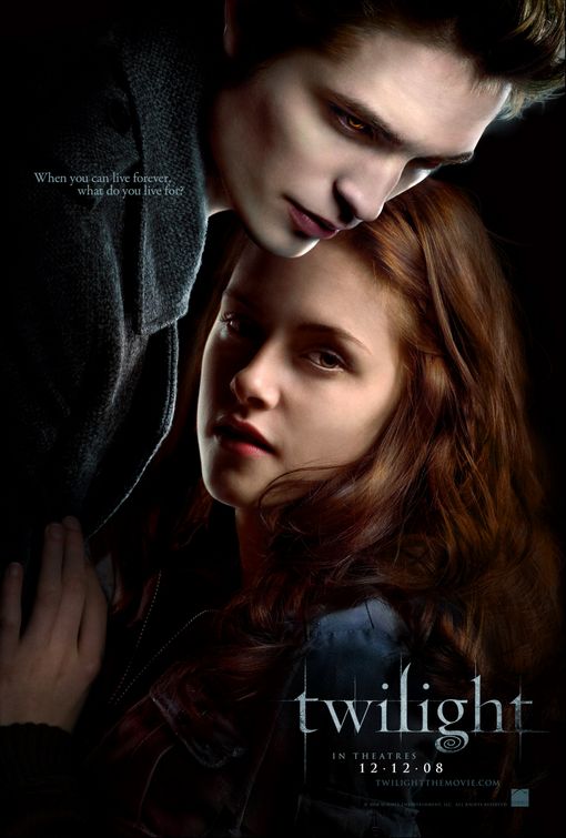
I researched 3 film posters, including The Human Centipede, Twilight and The Runaways.
The Human Centipede is in the horror genre. From the denotations, i got that it looked like there were people who were attached, and screaming. From the connotations, i thought that in the film, people were going to die. I presumed the target audience for the film was for teenagers, adults and horror fans, simply because it looks like a decent film that would scare you.
Twilight is in the romance genre. The denotations are that it is a dark film, love and protectiveness and romance. The connotations are that it's about a couple who fall in love, and a sparkly vampire. The target audience i thought, was towards pre-teens, teenagers, adults, and anyone who likes romance fantasy films.
The Runaways is in the music film genre, but you couldn't guess that from the film poster. There was a cherry, which looked like it was about to explode. The film title was red, signifying a female based film. The connotations are that it was about a music band, but i could only tell that from the title, and previous knowledge about the band. I would say that the target audience is for teenagers, adults, and anyone interested in music.


This is a great review Jade - Make sure you post your own poster up here because I am trying to reprint it! Cam :)
ReplyDeleteThanks Cam, i've uploaded it now XD
ReplyDelete